
Layerd
UX/UI Design
Turning skincare confusion into one clear, confident routine.
Layered is a skincare routine advisor that analyses what users already own and explains what to change and why.

Role
Product Designer
Team
Solo- just me!
Timeline
18-Week, 2025
Platform
Web Mobile
Making skincare routines make sense
Skincare advice is everywhere and trusted nowhere. Users bounce between conflicting social media tips with no way to tell whether their own routine is helping or working against them. Layered is a mobile web tool that reads what a user already owns, flags what isn't working, and explains why in plain language- then hands them one clear next step.
The Impact
Eighteen weeks of research, testing, and iteration produced a validated MVP built on evidence rather than instinct, including two features cut when testing showed they didn't earn their place. The final usability round confirmed the core bet: participants could interpret their own routine without help, and the plain-language explanations were what they valued most.
Jump straight to final designs
THE PERSONAL CATALYST
The project began with a personal constraint.

That experience led to an initial hypothesis: people may not need more skincare recommendations. They may need clearer guidance on what they already use. Interviews and testing determined whether the problem extended beyond my own experience.
WHY THIS PROBLEM MATTERS NOW
The skincare aisle moved online — and got louder.
A growing interest in ingredients had not created greater clarity.
An entire generation is learning skincare from TikTok, Reddit and unlabelled ingredient charts.
More choice than ever. Less confidence than ever.
IN USERS' OWN WORDS
What the conversations kept surfacing:

"People say one thing and then others say the opposite."
THE CLARITY GAP
Competitors personalise or explain. Nobody makes the 'why' clear. Layered does.

Ingredient databases
Explained products, but left users to construct the routine themselves.
Routine builders
Produced recommendations without making the reasoning visible.
The opportunity
Combine personalised analysis with plain-language explanation.
WHAT SHAPED THE PRODUCT
Distrust, disjointed plans, and dropped routines — the three things shaping every feature
Rather than asking users to rebuild their routine, Layered works with the products they have already bought and the habits they already understand. One clear plan, built from what users already own. Layered reframed skincare guidance from a product-discovery problem into a trust, comprehension and prioritisation problem.
PRIORITISING FEATURES
Strategic prioritisation: Two features didn’t make the cut.
Account creation, onboarding, and the three core routine insights (conflicts, order, gaps) shipped as high-value, low-effort must-haves. Confidence meter and routine compatibility score: both high-effort, showed lower user value in lo-fi usability testing and was deprioritised.

DESIGNING: LO-Fi WIREFRAMES
My initial designs exposed my own expert bias
Low-fi wireframes focused on the core loop: inputting a routine, seeing an analysis, and acting on it before any visual polish was invested. Testing at this stage didn't just validate the concept. It surfaced something I hadn't noticed: as someone who already reads ingredient lists for a living, I'd designed for a version of the user who knew as much as I did and not the target users who needed a guide.

01
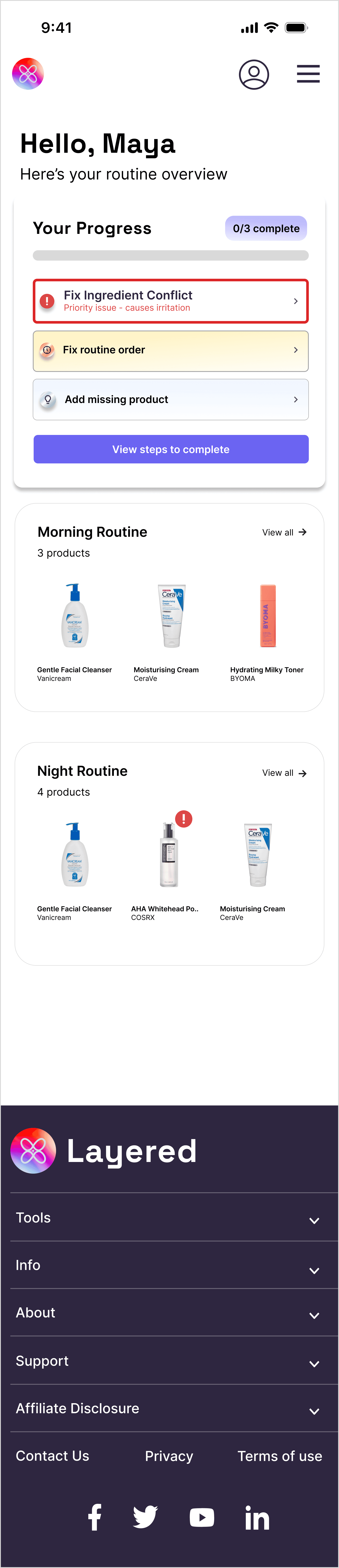
From abstract scores to actionable progress.
I ASSUMED → TESTING SHOWED
I assumed a score would feel more authoritative than a checklist. Instead, users couldn't distinguish the Routine Score from the Confidence Score at all.
DECISION
Cut both and replace them with three concrete actions.
OBSERVED RESULT
Participants immediately understood what was complete and what to do next.

02
From ingredient jargon to layering literacy.
I ASSUMED → TESTING SHOWED
I assumed users would recognise terms like AHA. Instead, they confused all five testing participants.
DECISION
Explain function, conflict and position in the routine instead of defining terminology.
OBSERVED RESULT
Beginner users could explain the conflict back in their own words.
03
From analyst dashboard to a guided next step.
I ASSUMED → TESTING SHOWED
I assumed full visibility built trust, like a specialist's dashboard. Instead, surfacing every metric at once obscured the one thing that mattered.
DECISION
Lead with one progress state and one next action, with details one layer deeper.
OBSERVED RESULT
All participants reached the relevant insight without prompting.

BEFORE
AFTER
HOVER ON EACH DESIGN FOR SCROLL VIEW
Layers, made visible
Logo built from four interlocking, infinity-like loops, each one a layer folding into the next, never fully separate. The mark echoes the name directly: skin understood in layers, not all at once. Soft, iridescent tones keep the science-backed foundation feeling human rather than clinical.

The core journey worked. Remaining friction became the iteration plan.
Testing limitation: Sessions used a fake personas skin routine products rather than participants' own routines, so some friction below reflects unfamiliarity with the sample products, not the design itself.
CRITICAL FINDING · 5/5 USERS
Terminology unclear (AHA, BHA) and too text heavy
I assumed users would recognise terms like AHA. Instead, they confused all five testing participants. 3/5 Users also mentioned too much reading. As such information was broken up and progressively disclosed as users acted on a conflict to avoid overwhelming users.

CRITICAL FINDING · 4/5 USERS
Order was implied. Now it's explicit.
The order requirement lived only in a sentence. 4/5 participants missed it entirely. Step numbers and drag-and-drop made the sequence visible in the list itself, not something users had to remember from an instruction. The progress bar was cut too. It belonged to onboarding, not this step.

CRITICAL FINDING · 4/5 USERS
Completed and outstanding actions blurred together
All three actions sat in a single list with no separation. Testers couldn't tell what they'd already fixed from what still needed attention. 4/5 lost track of their own progress. Splitting the list into "outstanding" and "completed" sections meant progress was visible without users having to track it themselves.

FINAL DESIGN 1/7
Onboarding:
The Skin Profile Questionnaire
Before Layered can personalise anything, the user uploads their gender, age, sex, skin type, goals and concerns. This is the foundation to create tailored recommendations for each user.
FINAL DESIGN 2/7
Product Routine Input
Users input what products they use in their existing morning and evening routine by searching the product database.
FINAL DESIGN 3/7
Analyse:
The Insights Dashboard
Layered flags for any ingredient conflicts, misordered steps, and gaps against users' skin goals. These users have been burned by conflicting advice online, so every insight explains its reasoning before it asks them to change anything. Evidence first, then the ask.
FINAL DESIGN 4/7
Improve:
Turning Insights into Action
The insight is only half of it. Layered turns each one into a single step with its reasoning attached, so improving the routine is a sequence of small decisions rather than a rebuild. The progress bar and completion states make the effort visible.
FINAL DESIGN 5/7
Actioning Ingredient Conflicts: Flag the risk, one-tap fix

Nothing gets binned
Nobody wanted to be told to stop using a product they’d already bought. Every conflict resolves into a way to keep using both.
FINAL DESIGN 6/7
Correcting Routine Order: Show the change, not just the problem

No scrolling to compare
Amber flags mark the two steps at fault, and the corrected sequence sits directly beneath them. No scrolling back to compare.
FINAL DESIGN 7/7
Missing Product: A recommendation needs a reason
Why it matters for you
Naming a gap isn't persuasive on its own. Every recommendation is justified against the goals the user set at onboarding.

Guidance lands with the product
A new product raises new questions: when, how much, how often. Tips appear beside it in the routine, and clear once they're learned.

REFLECTIONS
What this project changed about how I design.
The most valuable outcome was not a feature. It was a clearer understanding ofhow explanation, prioritisation and visual tone work together to create trust.
01
Transparency still needs hierarchy.
Users wanted the reasoning behind recommendations, but presenting every detail at once created a different form of confusion.
02
Trust is part of the interaction.
Credibility came from explaining the recommendation, respecting products already owned and avoiding sales-led language.
03
Next: test real routines over time.
The next study would use participants’ own products longitudinally to measure comprehension, confidence and continued use.